
%20(2).png)
%20(3).png)
In my Fashion & Branding at AMFI our task was to develop a sub-brand/brand extension for an already existing brand.
Practising working in-line with an already existing visual identity, we created Versace Vita
with a focus on the rebirth of archival garments.
Born from the essence of Pastiche and Gianni Versace's iconic maximalist design language, we aimed to re-contextualize iconic Versace elements from various eras with contemporary flair.

For our extension we engaged in depth consumer research, Zeitgeist and product research to develop a wholistic concept, visual identity, collection and product merchandising targeted towards a Gen Z audience.
%20(3)%20copy.png)
STUDY 2: DEVELOPING A BRAND ( CAMP )
Throughout the Fashion & Communications semester at AMFI our task was to develop a brand.
By creating a Communications Plan based on Online Marketing Theory, which involved understanding digital marketing strategies, audience segmentation and the creation of engaging content, we conceptualized CAMP, an outdoor brand with playful attire targeting Gen Z and Millennials.
At CAMP, we envisioned nature as our playground with the mission of retrieving lost feelings of child-like wonder, curiosity, and joy.
Collaboratively, we crafted a compelling brand storytelling aligned with playful imagery, capturing the essence of childhood exploration and spontaneous fun.
From conceptualizing, we brought this idea to life through a campaign photoshoot and video production.

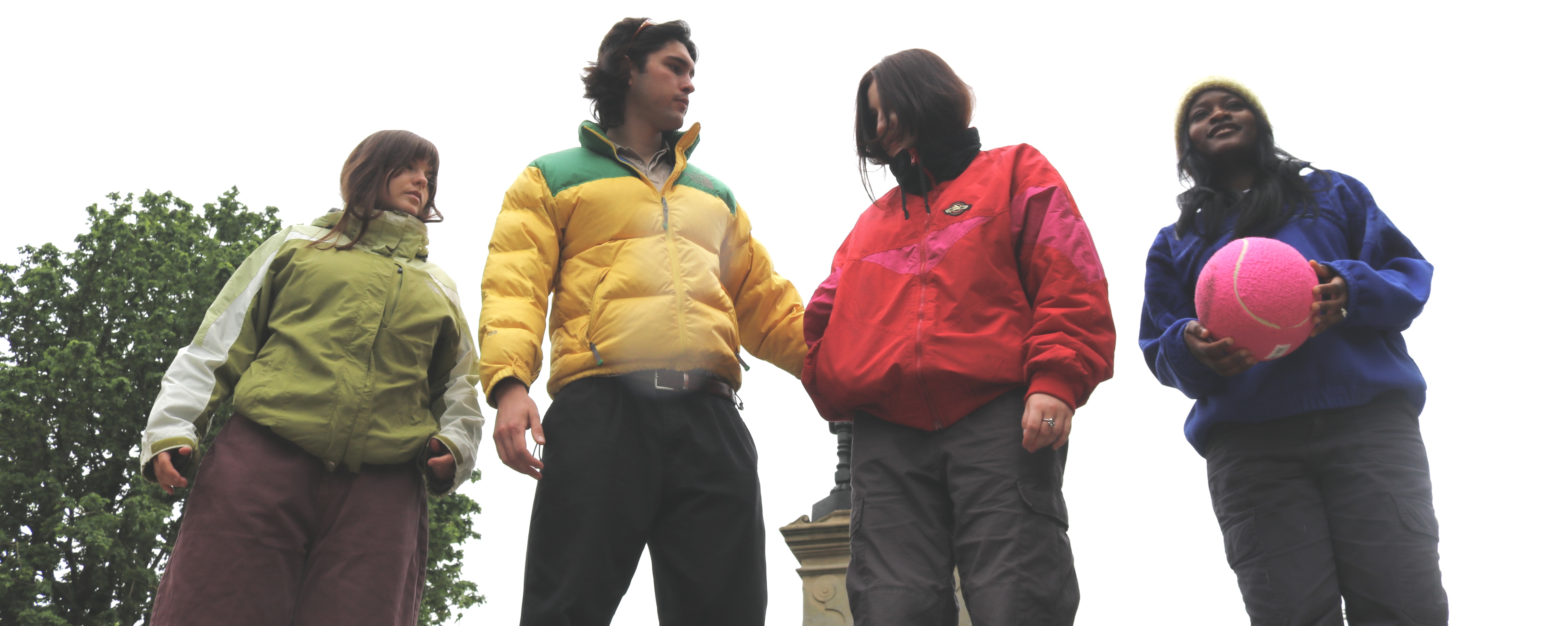
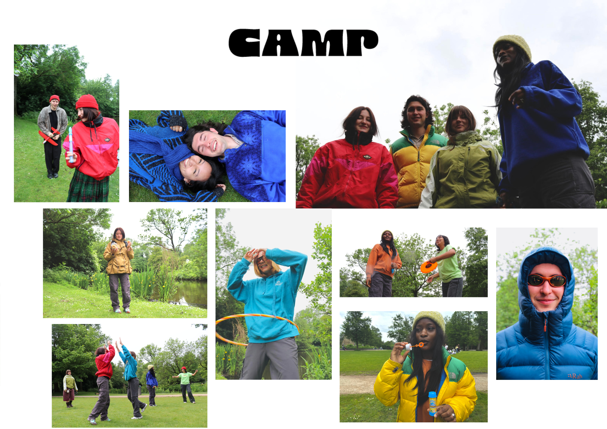
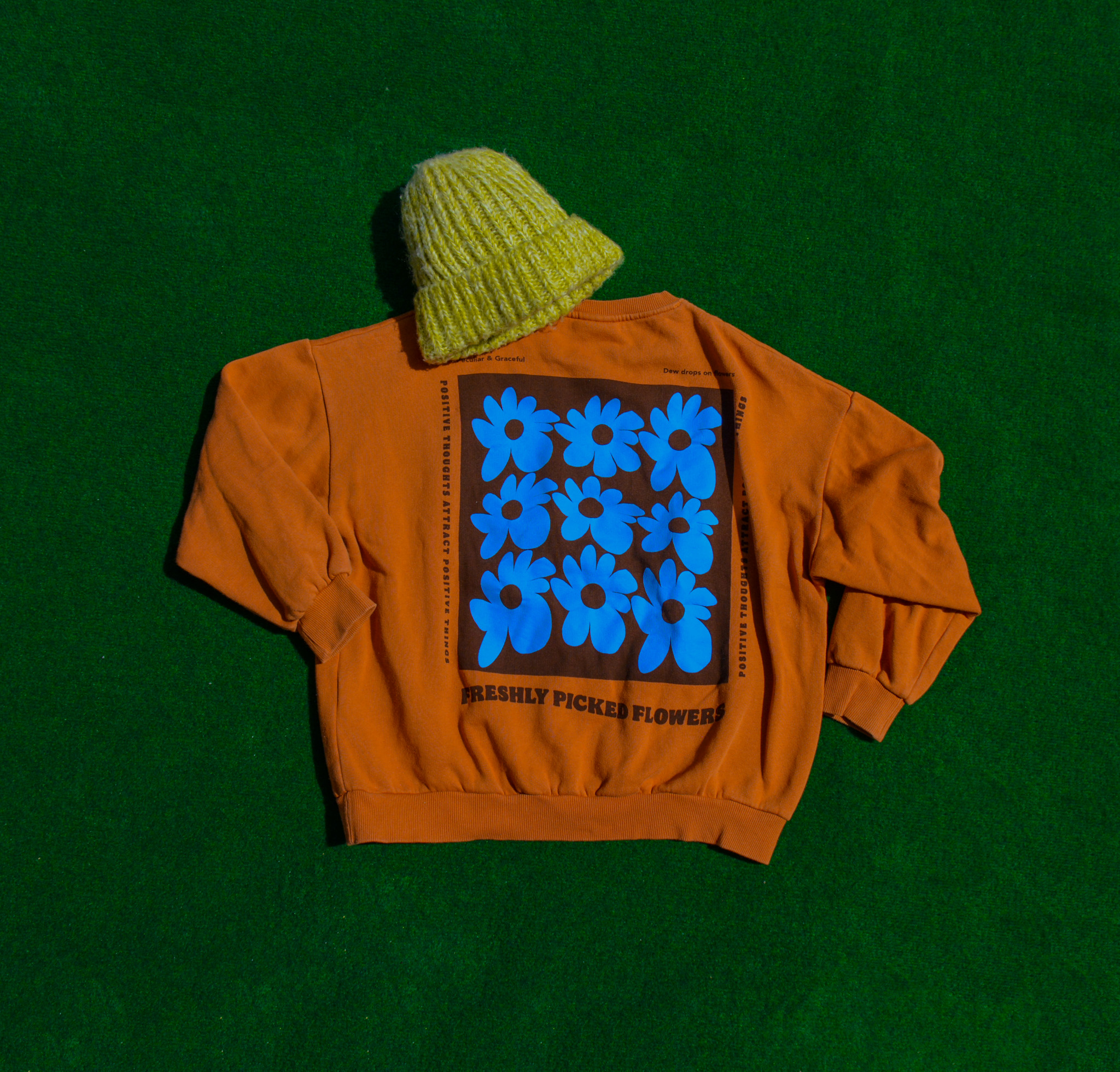
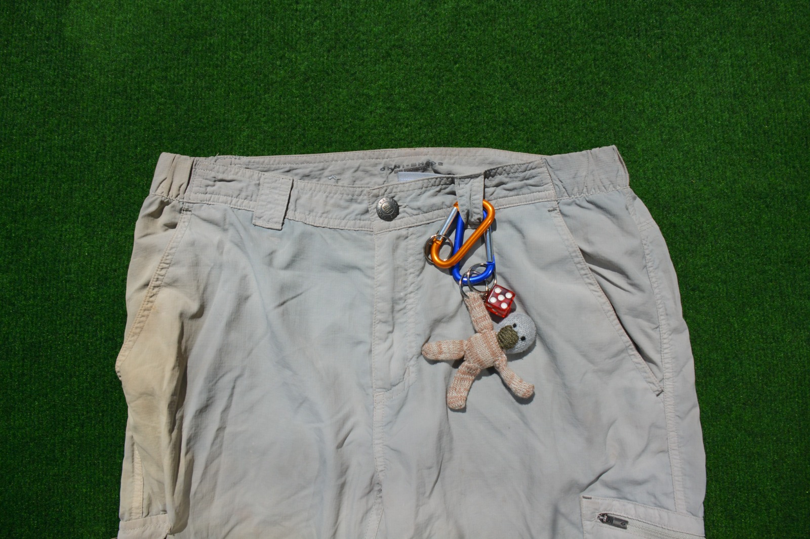
'Growing Up Is Overrated'. Our campaign message and content photography illustrates the joy of child-like outdoor adventures and activities with a focus on colourful, functional garments.
Through imagery and creating a visually appealing brand narrative, I was able to convey our brand's essence through art directorial planning and developing. From pre- to post-production, the use of models, location and atmosphere, as well as the selection of props and Styling, we aimed to encourage adults to follow our Motto and 'Go Play Outside' from time to time.
The key concept of our campaign video was satirical role-reversal, contrasting the playful essence of our brand with the mundane chores of adult life.
Symbolizing a longing for a care-free life, the video features a boy living an adult life, burdened by household chores. The narrative builds a strong emotional appeal to convey that CAMP is not just a brand, but a lifestyle choice that brings back the joy and freedom of childhood.
We aimed to showcase the opposite of what CAMP offers, simulating the longing to escape daily routines and embrace one's inner child, guided by our campaign message 'Growing Up Is Overrated'.


Developed CAMP's online presence on social channels Instagram and YouTube Shorts.
As the content creator and copywriter for our social media promotion strategy, I extended the visual identity to generate brand awareness, as well as creating engaging content that resonates with our specific target audience.
The visual aids above will take to our Instagram and YouTube feed, where you can explore the CAMP identity and my graphic/audiovisual work.
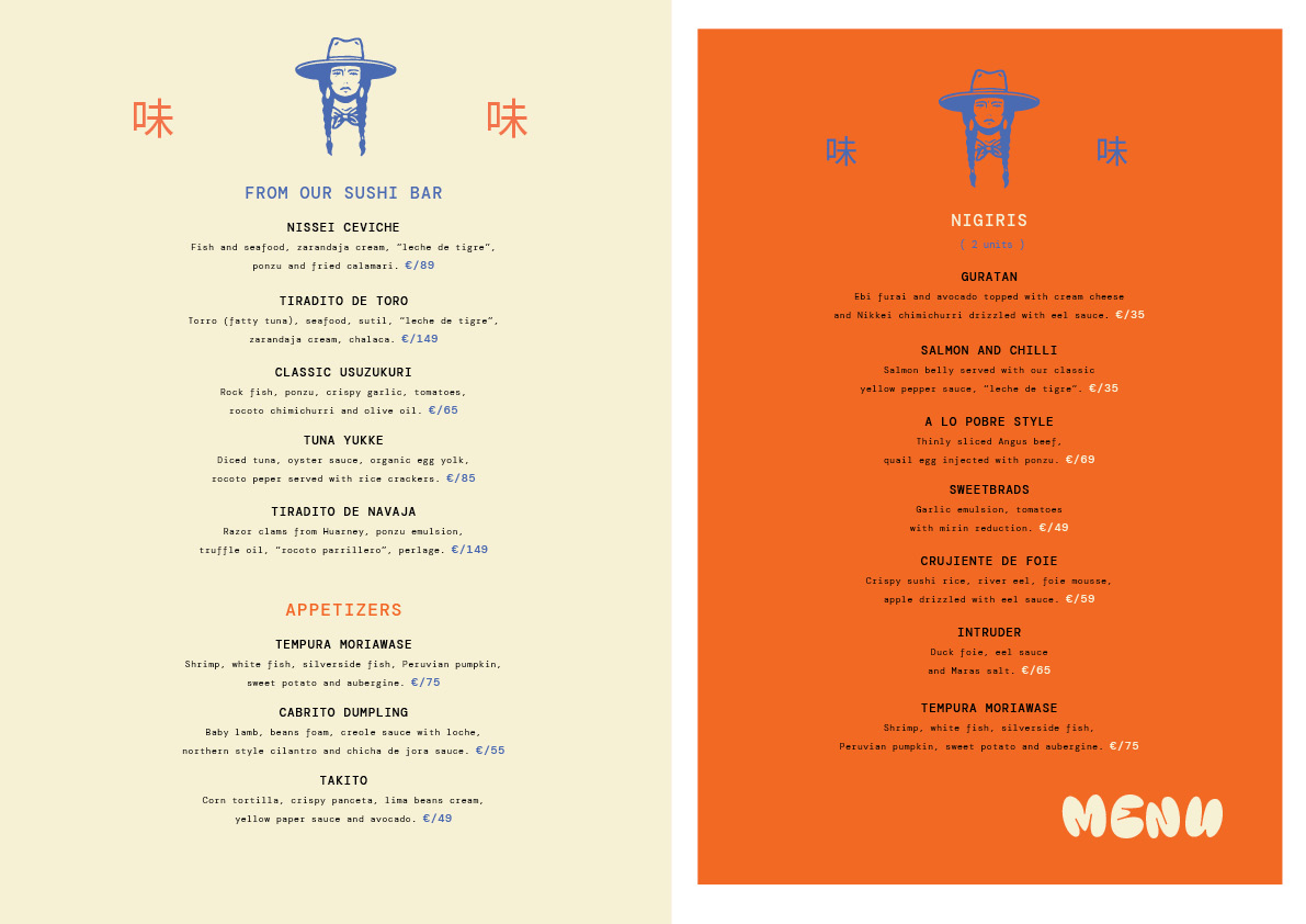
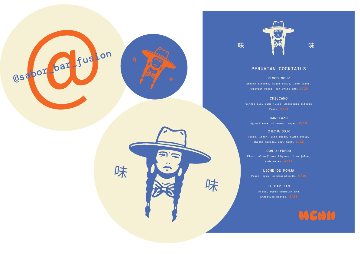
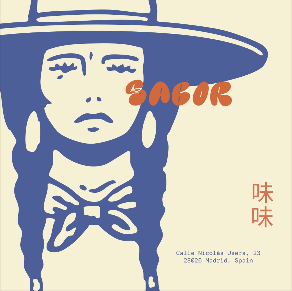
Briefing: Create a visual identity for a Japanese x Peruvian restaurant.
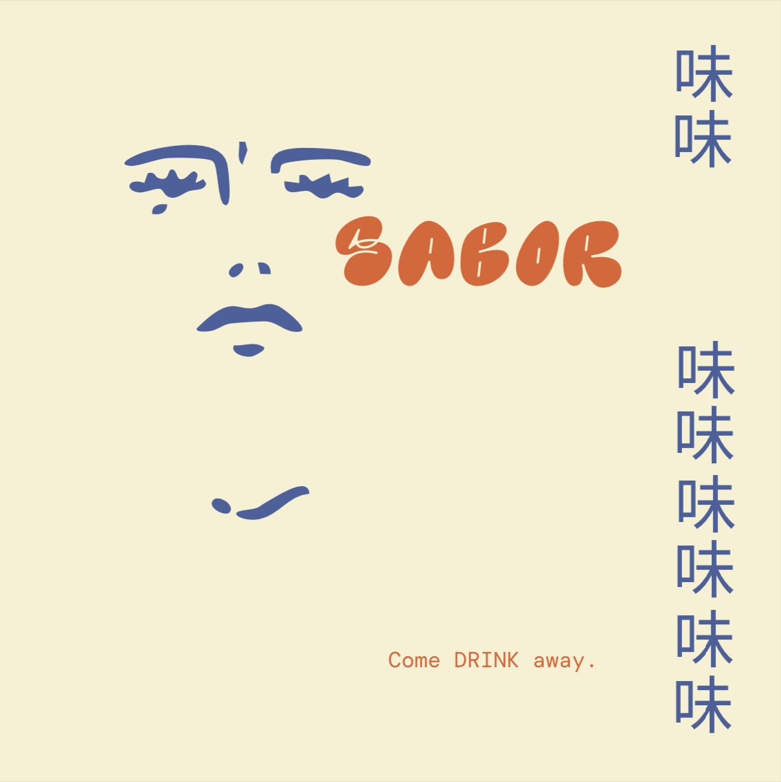
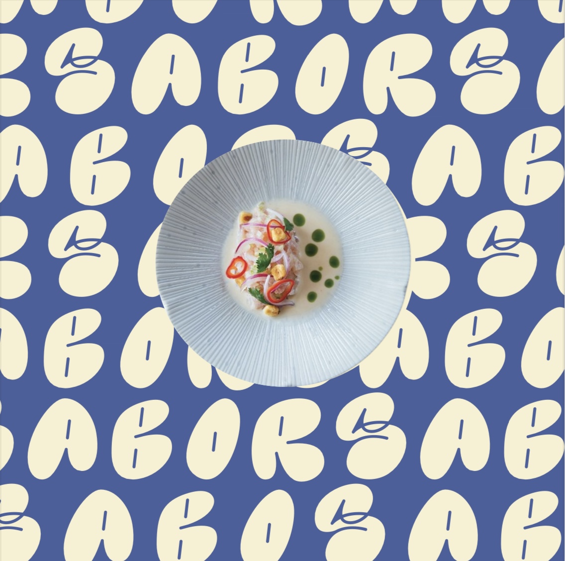
Inspired by the rich heritage of the Nikkei Culture - a term that honours Japanese immigrants in Peru - SABOR redefines fusion cuisine, combining the bold flavours of Peru with the refined umami techniques of Japan.
Developed a full brand identity from menus to coasters, merch mock-ups and social content.


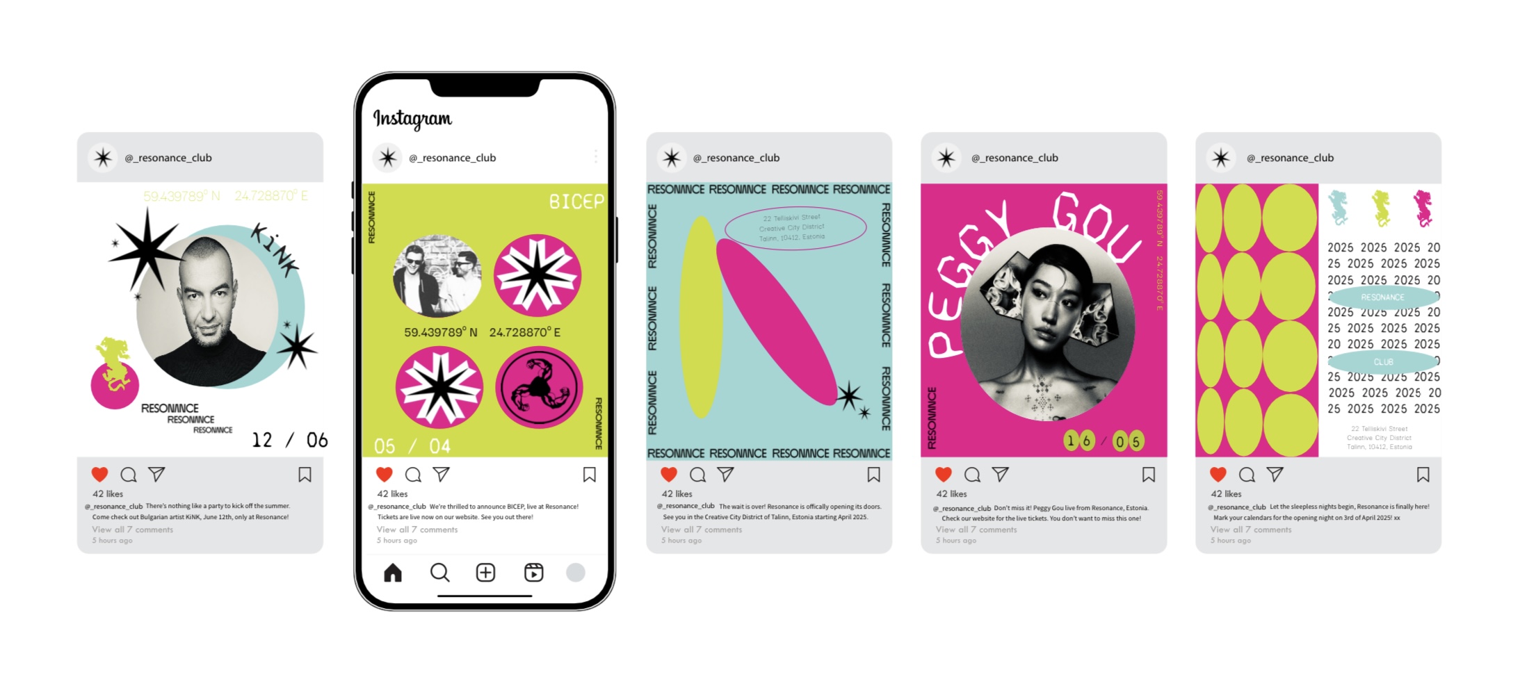
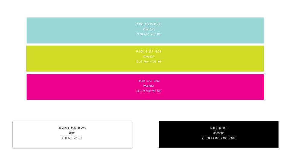
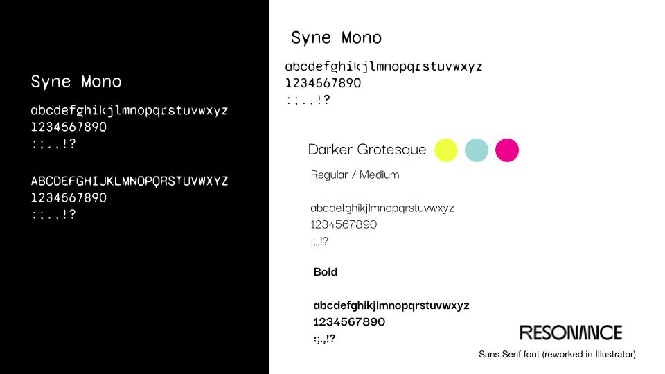
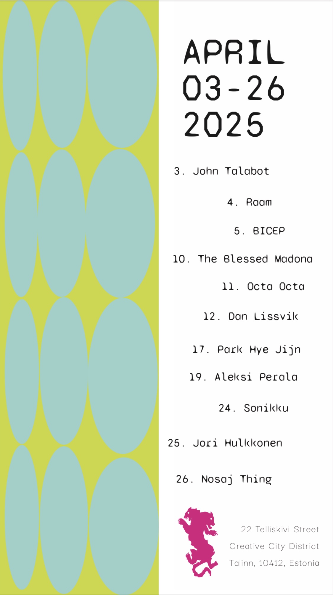
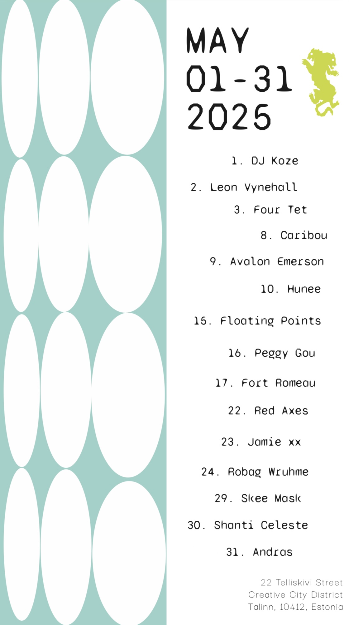
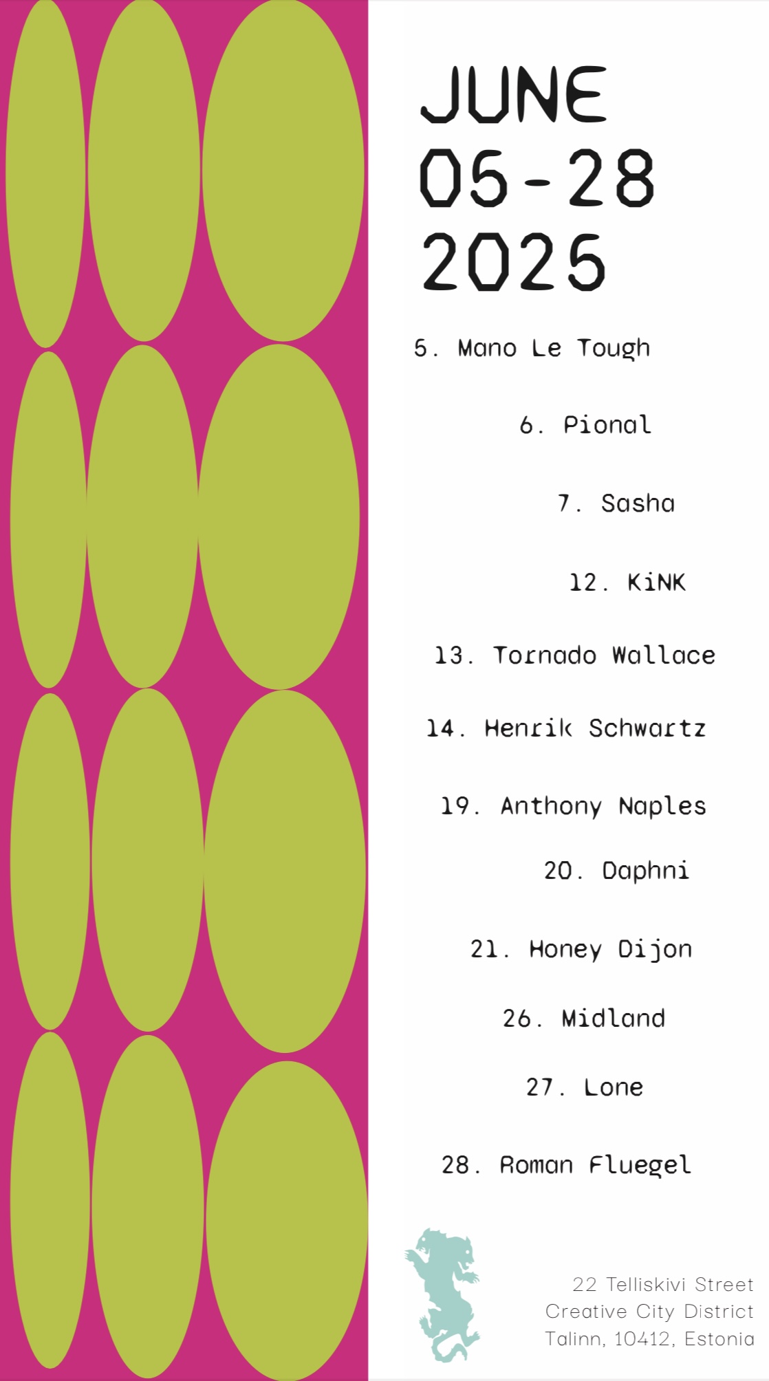
Bridging the gap between Estonian cultural identity and contemporary club culture, RESONANCE creates a space where tradition inspires innovation.
The key themes in the development of the graphic system are: cultural heritage as a foundation transformed into a modern aesthetic. The club speaks to the modern individual who craves meaningful experiences. Developed a full modular system that can be re-designed monthly in line with identity.


%20(1).jpg)
.jpg)
Celebrating the 80th anniversary of the DCW Chair, we aim to honour the timeless legacy of Charles and Ray Eames and their enduring partnership with vitra. manufacturing company.
The initiative highlights the value of this collaboration, showing the relevance of Eames’ design and craftsmanship in the contemporary world.Incorporated fun, tactile and playful elements in the promotion material.The project and its 2025 event production foster an appreciation for innovative design.
Project created under my personal visual archive and creative agency concept, the bite.
Art treatment x concep development, print & digital promotional materials and assets.
.svg)


